Wedding color trends in 2027 do not point toward one dominant shade. Two directions are emerging instead. Soft colors inspired by nature continue to appeal to couples who prefer a calm atmosphere. At the same time, vivid reds, yellows, blues and purples are bringing more personality to wedding design.
A strong palette is not simply the most fashionable one. It should reflect your story, suit your venue and feel connected to the destination. We also consider how colors will appear in natural light and photographs.
These seven palettes offer inspiration for a destination wedding in France. Each can be adjusted to your season, setting and personal style.
What is shaping wedding color trends in 2027?
Wedding colors are becoming more personal. Couples are drawing ideas from fashion and interiors, but also from landscapes, food, art and travel.
A Parisian private mansion, a Provençal estate and a vineyard near Bordeaux already have distinct colors and textures. The setting can become the foundation of the design.
We are also seeing greater contrast. Muted greens and warm neutrals remain present, while berry tones, cobalt blue and energetic yellow create a more expressive alternative. Neither direction is more timeless than the other. The way the colors are combined determines the result.
The 7 wedding color palettes to watch in 2027
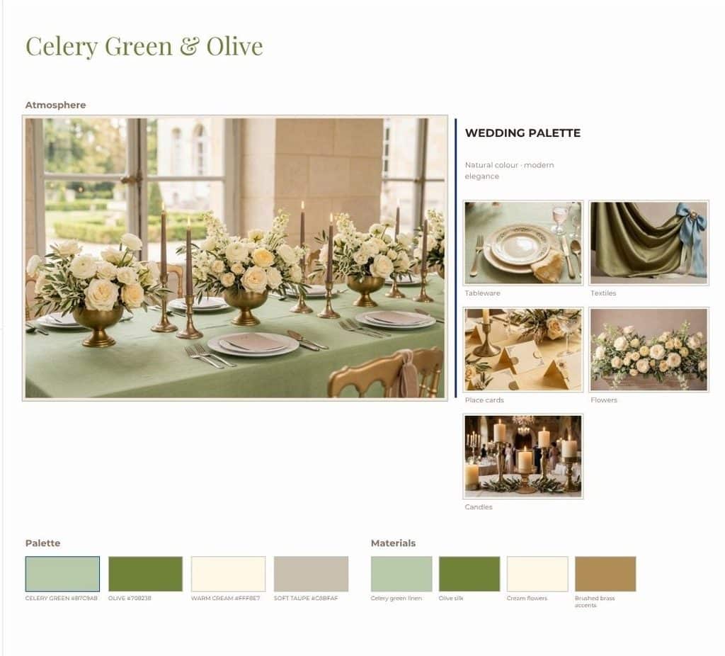
Celery green, olive and warm ivory
Celery green feels lighter and fresher than the sage tones seen in recent years. Olive adds depth, while warm ivory keeps the palette calm.
This combination suits gardens, vineyards and château grounds. Use it through foliage, linen, stationery and ceramic details.
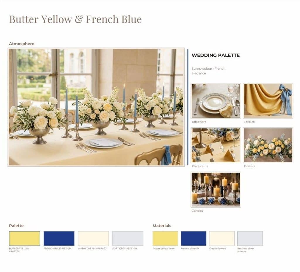
Butter yellow and French blue
Butter yellow brings light without the intensity of a bright primary yellow. French blue gives the palette structure and a clear connection to its surroundings.
This pairing can work in Paris or Provence. Blue may lead the stationery and tableware, while yellow appears in flowers, candles or small textile details. Couples drawn to this direction can also explore how to incorporate Parisian style into a wedding.
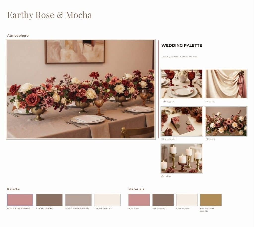
Earthy rose, mocha and soft blush
This palette offers a warmer interpretation of romantic pink. Earthy rose and mocha ground the softer blush tones. The result feels gentle without becoming overly sweet.
It works particularly well in private mansions and historic interiors. Paper, textured linens and subtle floral variations can create depth without adding more colors.
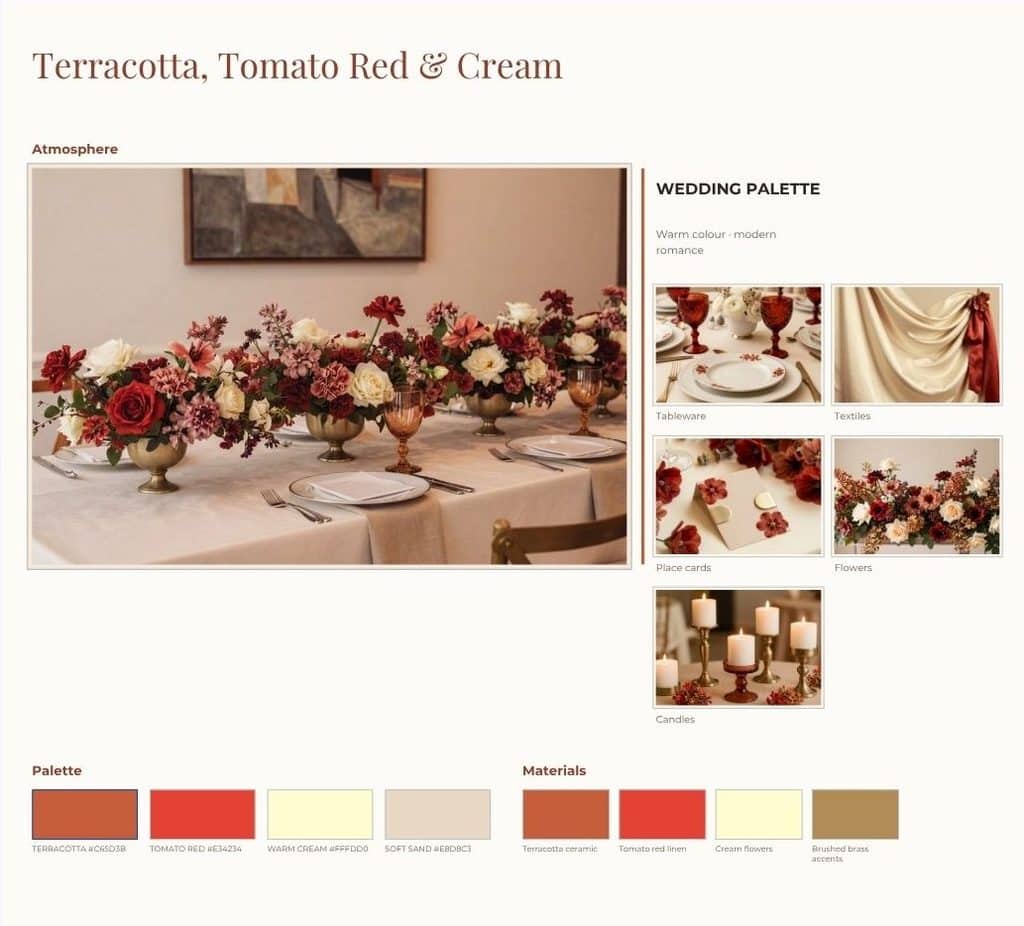
Terracotta, tomato red and warm peach
Terracotta remains relevant, but 2027 introduces more energy through tomato red and warm peach. The combination feels generous and sunlit.
It is well suited to Provence, the French Riviera and venues surrounded by pale stone. Use tomato red as an accent rather than repeating it everywhere. This allows the softer tones to connect the design.
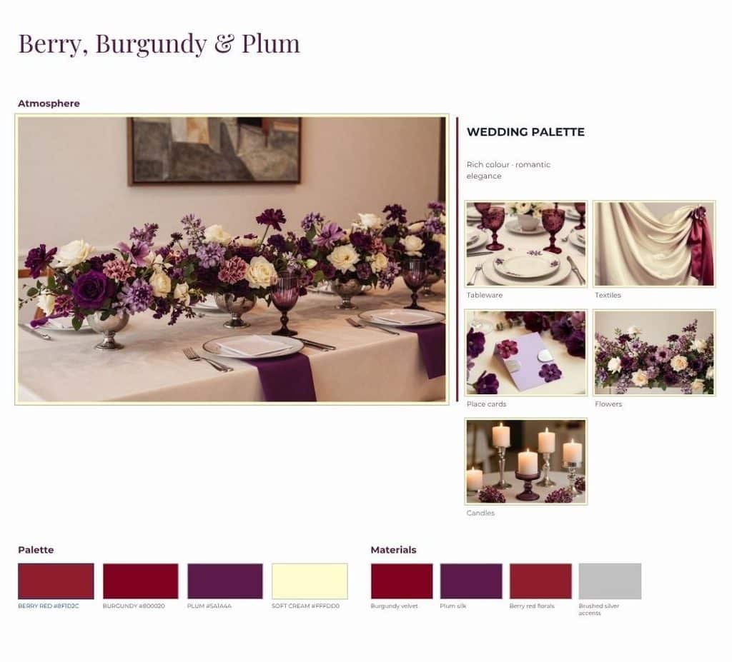
Berry red, burgundy and plum
Berry red gives burgundy and plum a fresher quality. Together, these colors create depth for evening receptions and celebrations in the cooler months.
They can appear in flowers, candles, stationery and selected fabrics. Warm neutral tableware or pale linens will keep the palette balanced.
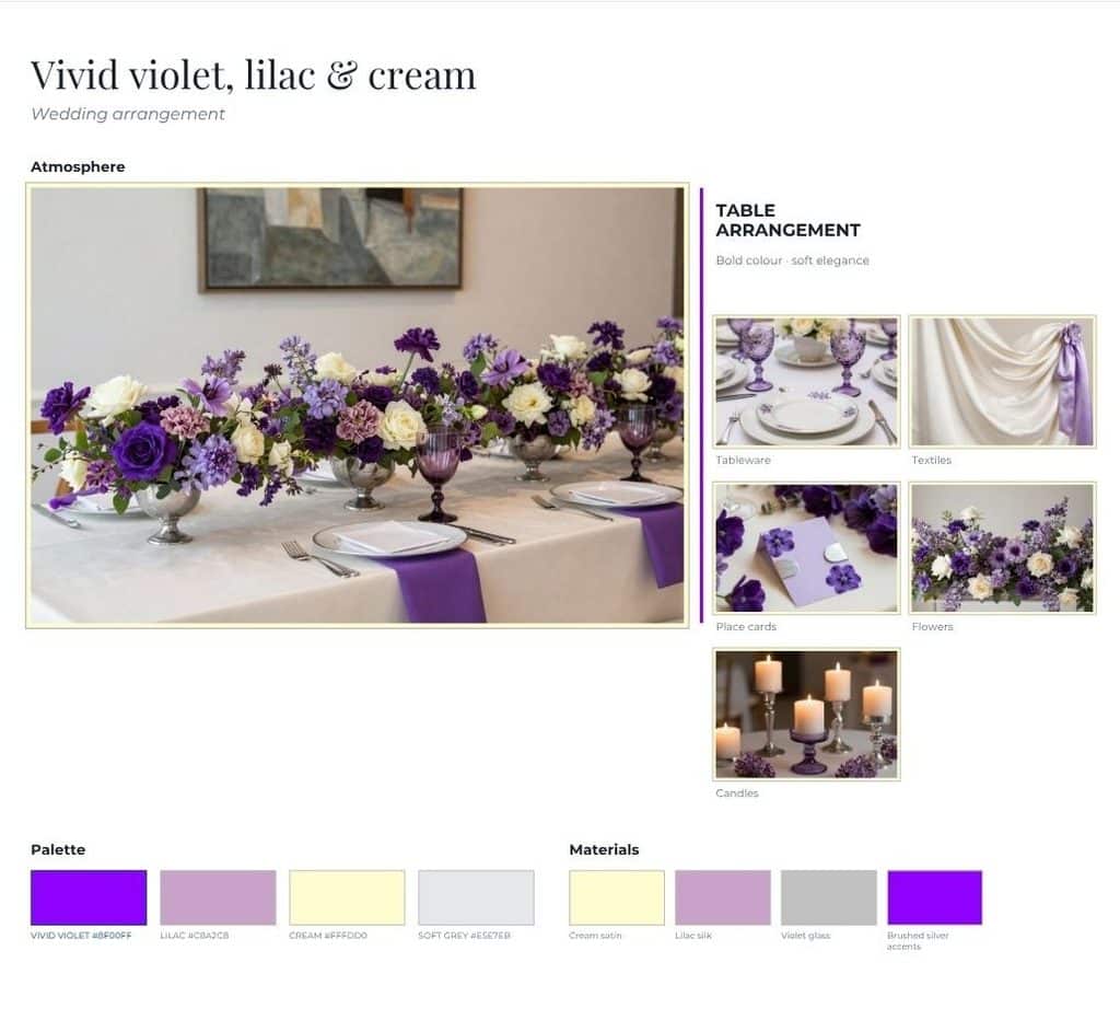
Vivid violet, lilac and cream
Vivid violet offers a more expressive alternative to familiar pastel purple. Lilac creates the transition, while cream gives the eye a place to rest.
This palette can suit a spring garden or a contemporary Paris venue. Use strong violet as a focal color rather than repeating it everywhere.
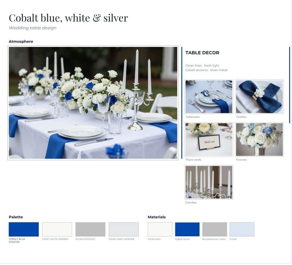
Cobalt blue, white and silver
Cobalt blue creates a clear, graphic look. White adds freshness, while silver introduces light without the warmth of gold.
This palette works well for rooftops, modern interiors and celebrations near the sea. Cobalt may be easier to use in stationery, glassware, attire and linens than in flowers. The white elements can then connect the different spaces.
How to adapt a 2027 color palette to a wedding in France
Start with the destination and venue
Choose the location before finalizing the palette. The architecture, landscape and materials already present will influence how every color is perceived.
Our guide to choosing the right French region for your destination wedding explains how the atmosphere changes between Paris, Provence, Bordeaux, the Loire Valley and the French Riviera.
If you are marrying in the capital, compare the colors and light of different romantic wedding venues in Paris before committing to a visual direction.
Let season and light adjust the palette
The same colors can feel very different across the year. Spring light may support translucent fabrics and delicate tones. An autumn or winter dinner may require deeper accents and warmer materials.
The time of day matters too. Test colors in daylight and under the lighting planned for dinner. Our guide to the best time to get married in Paris can help you consider the wider seasonal experience.
Distribute color across the full wedding design
A coherent design does not repeat every color in every element. Give each shade a purpose.
Use one color as the foundation. Add one or two supporting tones. Reserve the strongest shade for intentional accents.
Stationery can introduce the palette before the wedding. Flowers, linens, candles, tableware, lighting and wedding party attire can then continue it in different proportions. For floral decisions, see our guide to Paris wedding flowers and color palettes.
How to follow a color trend without dating your wedding
A trend feels dated when it has no connection to the couple or the setting. Begin with the atmosphere you want to create. Then choose the current influence that supports it.
Use this checklist before approving your palette:
- Does it complement the venue?
- Does it work in the season and planned lighting?
- Does each color have a clear role?
- Can your florist and rental suppliers source the required shades?
- Do physical samples still feel cohesive together?
- Does the result reflect you beyond the trend?
Avoid making decisions from screens alone. Paper, fabric, flowers and paint can all display the same color differently. Ask key creative partners to work from one approved palette.
Personal choices will always give the design more longevity. Our guide to personalizing a destination wedding without stress can help you decide which details deserve attention.
Common wedding color mistakes to avoid
- Choosing the palette before confirming the venue.
- Combining several trends without one clear direction.
- Requiring every item to match exactly.
- Ignoring the effect of natural and artificial light.
- Selecting floral colors that are difficult to source naturally.
- Copying an inspiration image without adapting it to France.
- Investing in many small decorative details instead of a few meaningful focal points.
A palette should guide decisions, not create pressure. When a color is unavailable in flowers, it may work better in stationery, candles or textiles.
Key takeaways
- Wedding color trends in 2027 include both natural palettes and expressive colors.
- The venue and destination should guide the final combination.
- Each shade needs a defined role within the design.
- Light, season and materials change how colors appear.
- Trends create inspiration, but personal choices create coherence.
Frequently asked questions about wedding color trends 2027
What is the most popular wedding color for 2027?
There is no single universal color. Fresh greens, soft yellow, berry tones and stronger blues are all appearing across 2027 forecasts. The right choice depends on your setting and personal style.
Are bold wedding colors returning in 2027?
Yes, but they are not replacing softer palettes. Cobalt, violet and red are being balanced with cream, blush, stone and natural greens.
How many colors should a wedding palette include?
There is no strict number. A practical structure includes one foundation color, one or two supporting shades and an accent. This creates variety without losing coherence.
Should the venue influence our wedding colors?
Yes. Existing walls, floors, gardens, furniture and natural light affect every color. A palette should complement the venue or create a deliberate contrast.
Can the same palette work in every season?
The same palette can be adapted. Use lighter tones and materials in spring or summer. Add deeper accents, candles and richer textures in autumn or winter.
How can we make a 2027 wedding palette feel timeless?
Connect it to your story, venue and destination. Use the most fashionable shade as an accent rather than allowing it to define every element.
Create a wedding palette that belongs in France
A coherent color palette does more than follow a forecast. It connects the couple, the venue and the experience offered to guests.
At CEREMONIZE, we help international couples transform inspiration into a coherent celebration while coordinating the creative and practical details in France. Discover our approach to destination wedding planning in France.


